Fitiv
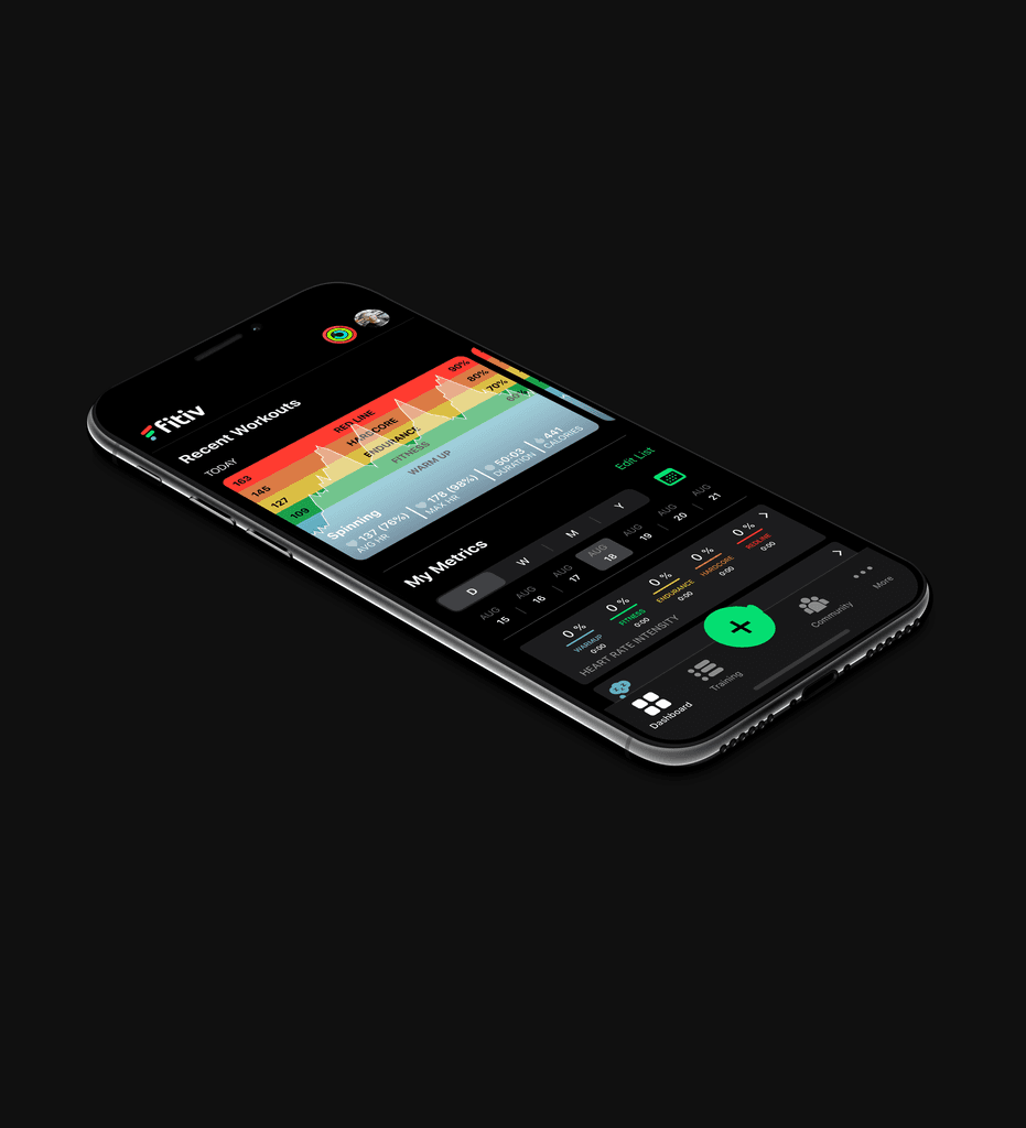
Design enhancements for a mobile fitness application.

PHASE 1
Discovery
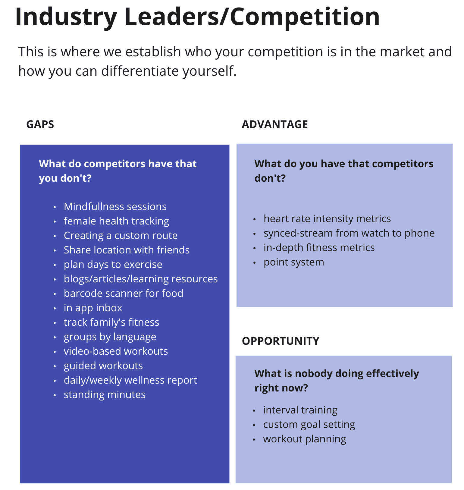
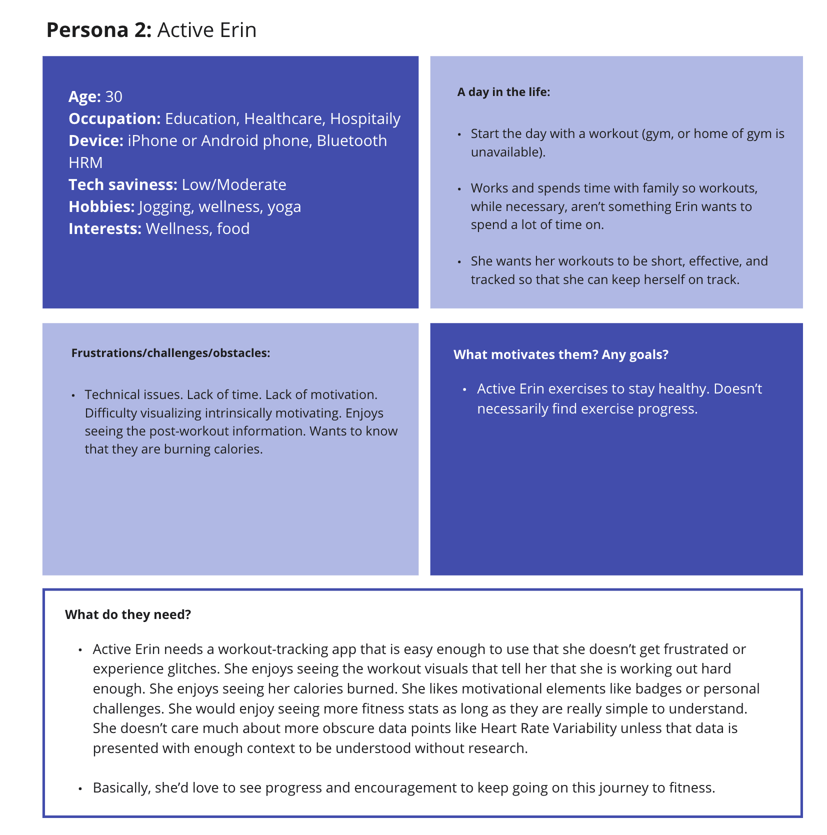
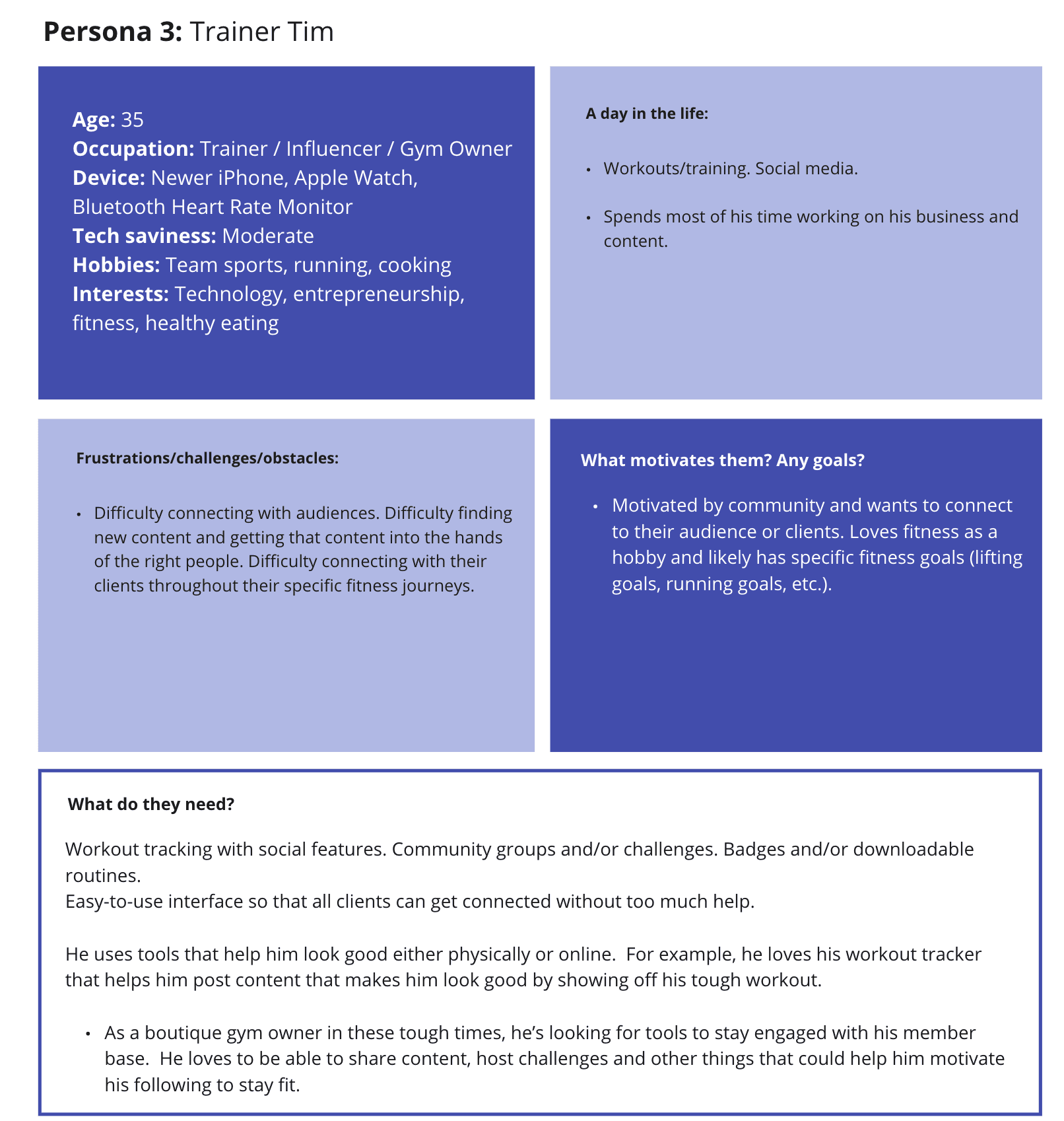
Given that the client was an expert in this space, we kicked off our engagement with a virtual Strategy Workshop using Miro to capture some of this knowledge. We spent some time learning more about the client's product journey and vision; established the goals, requirements, and expectations for the project; walked through risks, assumptions, and possible constraints; and learned who their main competitors and users were. As they had recently conducted surveys with their current users, we went over high level insights and integrated them into the creation of user personas.




Project Constraints & Requirements
From the kickoff meeting, we were able to establish some requirements for this project:
Improve UX of the existing app
Prioritize and integrate feedback on new features and changes from user testing
Optimize for gym/brand partnerships and virtualization of workouts
Improve discoverability of key features in the app
Holistic (all-in-one app) but simplified experience
Utilize current branding and design system
Keep last workout on homescreen
Maintain activity rings and profile icons throughout app
Create a User Testing Toolkit
Create a User Testing Toolkit
PHASE 3
Design & Test
Information Architecture
Now that we determined the new features and major usability changes to make, I drafted the new information architecture (IA) diagram to map out how all of the features fit together and where to find them in the app. Each iteration was shared with the client team for feedback until they were happy with the structure.
Wireframing
Alongside the IA diagrams, I began sketching out how each screen would look and function and received early feedback from the client team before jumping into more detailed wireframes. Given that the client already had an established component structure and library, I used these elements in grayscale to quickly iterate on later versions of wireframes. There were 2 major iterations of wireframes completed before user testing, and another after user testing (see below).
Usability Testing
Usability testing was conducted on the 2nd major iteration of wireframes. I created a User Testing Toolkit for the client to run these on their own, which consisted of a test plan and script, consent forms, participant screener, note taking guide, and grayscale prototype. 27 people completed the screener, and 6 individuals across a variety of ages, fitness levels, activity types, and app experience were selected to participate in a 1 hour-long usability test session led by the client team.
These were the research questions and assumptions we wanted to test:
Do users need a schedule of their workouts in-app?
Are users comfortable with their workouts being viewable by other members?
Are users able to find the workout history?
What are users' thoughts on goal setting?
What types of trends info do users expect to see?
What types of post-workout stats do users expect to see?
What do users think is the difference between programs, workouts, and all workouts?
Are users able to find their saved/bookmarked workouts?
Do users have a need to create workout programs?
Are users able to create subsequent programs/workouts after the first program/workout is created?
What is the user experience of creating a program/workout?
What heart rate info do users expect to see on their daily dashboard?
How and where do users expect to be able to tag their workouts?
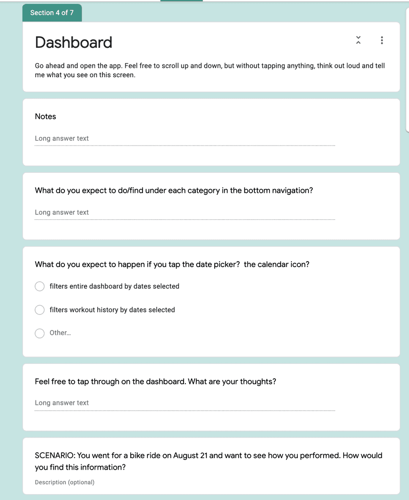

Key Findings
Difficult to associate date picker with metrics since it is hidden when the user scrolls (prototype limitation)
Finding a past workout was not very intuitive as users expected to find a full list view of their workouts they could parse through.
Challenges ranked lower in importance and interest to Metrics. Many users did not see an immediate value to it.
While most users were interested in the concept of personal challenges, few users were interested in seeing a generic leaderboard.
Recovery Heart Rate stats was difficult to find.
Trends graph was useful but difficult to understand fully what each element meant.
While users were able to find the Goals feature, a few users struggled with finding how to set a goal.
Users would like to see all heart rate stats in one place and unsure what MHR is.
Still some confusion around the difference between Programs & Workouts. Some users assumed Workouts relate to past activities you have completed.
Adding a workout to a program was not very intuitive. Activity type was not clear as there can be multiple activities in one program.
My Schedule was not overly exciting and takes up too much space for little value. Some users mentioned scheduling workouts within their personal calendars.
Lessons Learned
Managing lower budgets and timelines: This project ended up going over budget and extended past the typical timeframe we spend on a Design Blueprint project (6-8 weeks). Some reasons for this included that rather than having all client team members on the design review calls, we only had our main point of contact who would then share with his team and they would follow-up with several documents of written feedback from each team member for each iteration of the IA. This was a time consuming process that took up a lot of the budget, however I made sure that moving forward on wireframe reviews, I would either have the entire team present or had the client consolidate his team's feedback. Furthermore, the client had to take a break from the project to focus on an internal app release, adding 2 months to the wrap-up of the project. Given that we were working with a small budget, clearer expectations on the format and timeframe that feedback should be given should have been established better at the beginning to mitigate this.
Don't offload the user testing: Due to small budget, the client wanted to handle conducting the usability testing of the wireframes. Being their first time, we created a User Testing Toolkit which consisted of a participant screener, test plan and script, and prototype. Offloading the testing did not save us as much budget as we hoped, as a lot of time was spent on creating a script with guidelines and tips, training the team on how to conduct a usability test, and we were tasked with analyzing the raw data and coming up with actionable recommendations afterwards. Furthermore, some flows were left untested due to running out of time. Testing is something that should be done by or alongside a trained researcher, and therefore should not be offered as an option for inexperienced clients.
The Challenge
The FITIV Pulse mobile app helps tens of thousands of fitness enthusiasts to achieve their fitness goals by providing a world class mobile + wearable health and fitness tracking solution and partnering with gyms like Basecamp. FITIV had gathered valuable user feedback and observed new market trends for opportunities to reach a much broader membership base. In particular, the COVID-19 pandemic had only amplified the need for fitness studios and gyms to be able to connect to their members virtually. The current method via social media or Zoom made it difficult for fitness studios to monetize their content, thus presenting FITIV with a unique opportunity to use their platform to support the monetization of live and streamable content while also boosting motivation and engagement by gamifying the experience through points-based fitness challenges and leaderboards.
Our challenge was to help integrate and prioritize new features and changes suggested from user research and enhance the current FITIV platform without removing any of the core functionality loved by their current 25K+ active members.
The Process
Over the span of 8 weeks, I worked closely with the client's team (CEO, product designers, and engineers) to hone in on our focus for this engagement.
1
Discovery
Kickoff Workshop
Competitor Analysis
Personas
Business Requirements2
Ideation
Heuristic Evaluation
Ideation Workshop
Feature Prioritization3
Design & Test
Information Architecture
Wireframes
Usability Testing
Hi-fidelity Designs
PHASE 2
Ideation
Heuristic Evaluation
After the Kickoff/Strategy Workshop, I dug in deeper into the research and documentation provided by the client. I also conducted a Heuristic Evaluation on the current usability of the app to determine which parts of the app needed to be fixed before adding new features. This would help when prioritizing what features to scope out during the subsequent Ideation Workshop. The following are examples of some of the findings from the evaluation:
Ideation Workshop
The goal of the Ideation Workshop was to determine and prioritize the best ideas to work on for this project. Looking back on each persona, I formulated User Needs Criteria and subsequent How Might We Statements to guide our ideation exercise. Meeting attendees were given 1 minute per How Might We Statement to generate as many ideas as possible to solve the statement, and then had 10 votes to place on their favourite ideas.
The top voted ideas were then moved over to a Feature Prioritization Matrix based on User Value and Effort to implement
Ideas that were high user value were prioritized, with the lower effort being taken on by the FITIV team and the higher effort being the focus of our project due to more expertise and focused exploration required. These features included:
Prebuilt workout plans
Metrics trends
Post-workout stats for interval training
Downloadable/purchasable plans from app members
Build your own workout plans and programs
Custom goal setting (weekly, monthly, yearly)
Opt-in community challenges
Duration
10 weeks
Team
Only me
My Contributions
Competitor Analysis
Information Architecture
User Testing
UX/UI Design
Design System
My Role
Product Designer
© Samra Ebadi 2024
Fitiv
Design enhancements for a mobile fitness application.

Duration
8 weeks
My Role
Product Designer
Team
Only me
My Contributions
Strategic Workshop
Heuristic Evaluation
Ideation Workshop
Usability Testing
UX/UI Design
Back to top
The Challenge
The FITIV Pulse mobile app helps tens of thousands of fitness enthusiasts to achieve their fitness goals by providing a world class mobile + wearable health and fitness tracking solution and partnering with gyms like Basecamp. FITIV had gathered valuable user feedback and observed new market trends for opportunities to reach a much broader membership base. In particular, the COVID-19 pandemic had only amplified the need for fitness studios and gyms to be able to connect to their members virtually. The current method via social media or Zoom made it difficult for fitness studios to monetize their content, thus presenting FITIV with a unique opportunity to use their platform to support the monetization of live and streamable content while also boosting motivation and engagement by gamifying the experience through points-based fitness challenges and leaderboards.
Our challenge was to help integrate and prioritize new features and changes suggested from user research and enhance the current FITIV platform without removing any of the core functionality loved by their current 25K+ active members.
The Process
Over the span of 8 weeks, I worked closely with the client's team (CEO, product designers, and engineers) to hone in on our focus for this engagement.
1
Discovery
Kickoff Workshop
Competitor Analysis
Personas
Business Requirements
2
Ideation
Heuristic Evaluation
Ideation Workshop
Feature Prioritization
3
Design & Test
Information Architecture
Wireframes
Usability Testing
Hi-fidelity Designs
Discovery
Given that the client was an expert in this space, we kicked off our engagement with a virtual Strategy Workshop using Miro to capture some of this knowledge. We spent some time learning more about the client's product journey and vision; established the goals, requirements, and expectations for the project; walked through risks, assumptions, and possible constraints; and learned who their main competitors and users were. As they had recently conducted surveys with their current users, we went over high level insights and integrated them into the creation of user personas.
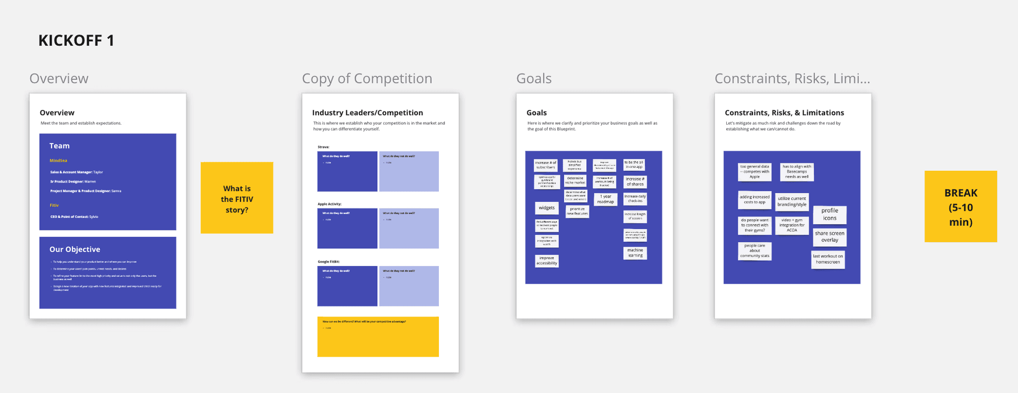


Strategy Workshop
Project Constraints & Requirements
From the kickoff meeting, we were able to establish some requirements for this project:
Improve UX of the existing app
Prioritize and integrate feedback on new features and changes from user testing
Optimize for gym/brand partnerships and virtualization of workouts
Improve discoverability of key features in the app
Holistic (all-in-one app) but simplified experience
Utilize current branding and design system
Keep last workout on homescreen
Maintain activity rings and profile icons throughout app
Create a User Testing Toolkit
Create a User Testing Toolkit
PHASE 2
Ideation
Heuristic Evaluation
After the Kickoff/Strategy Workshop, I dug in deeper into the research and documentation provided by the client. I also conducted a Heuristic Evaluation on the current usability of the app to determine which parts of the app needed to be fixed before adding new features. This would help when prioritizing what features to scope out during the subsequent Ideation Workshop. The following are examples of some of the findings from the evaluation:
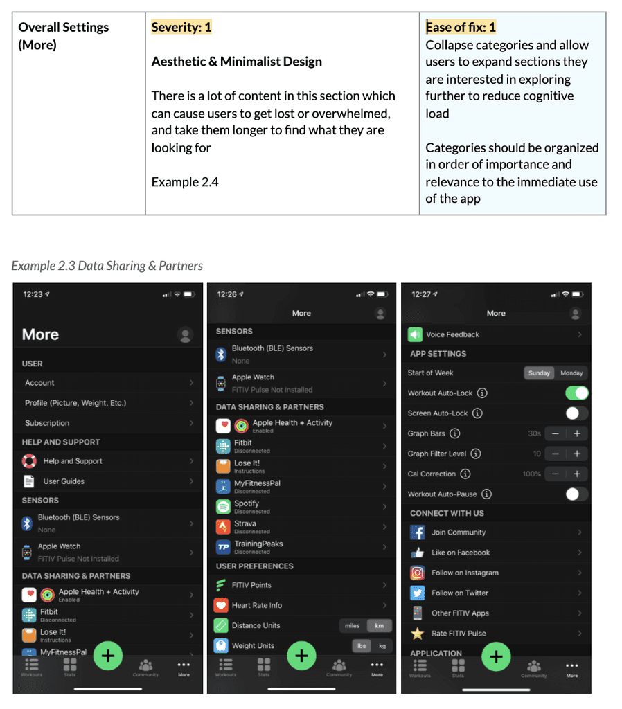
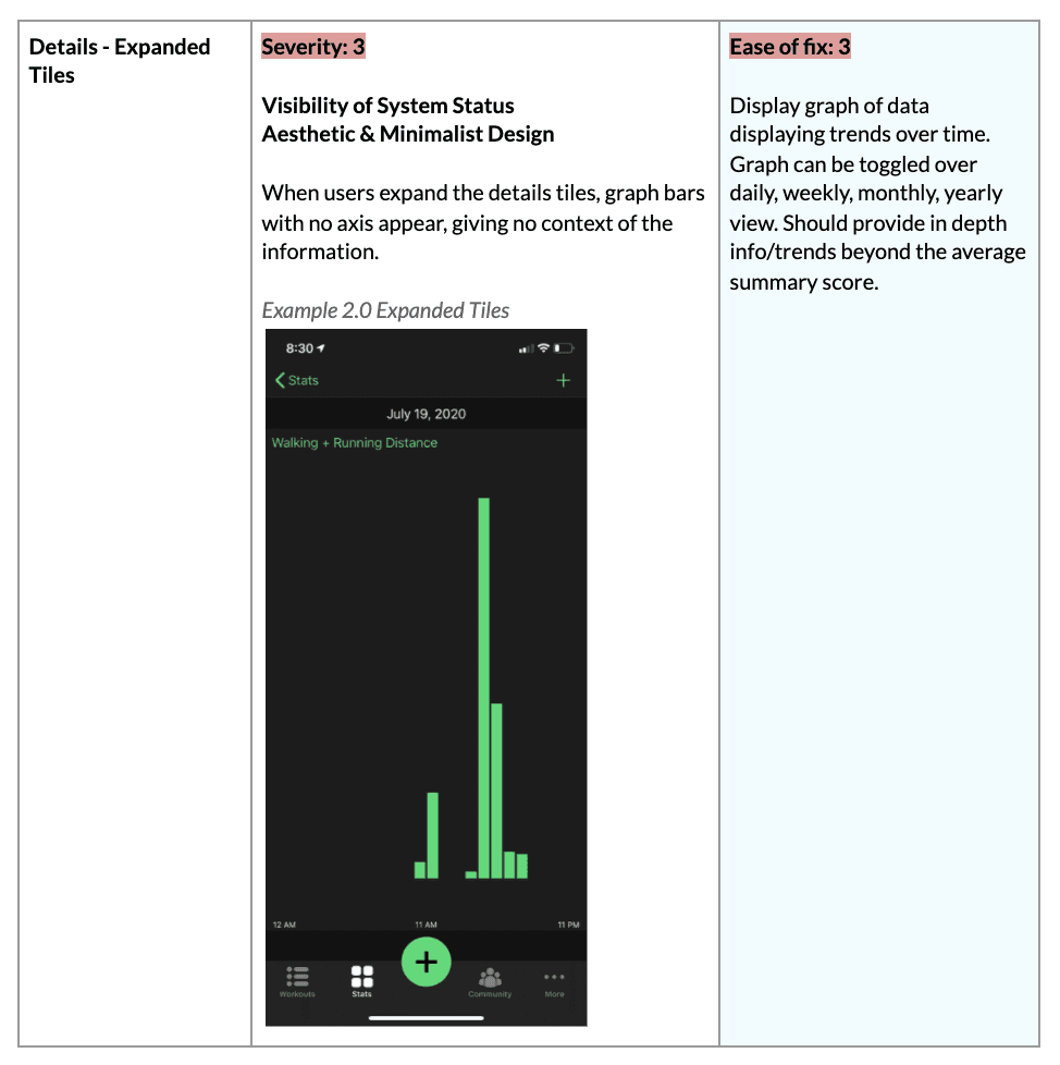
Sample of heuristic evaluation findings
Ideation Workshop
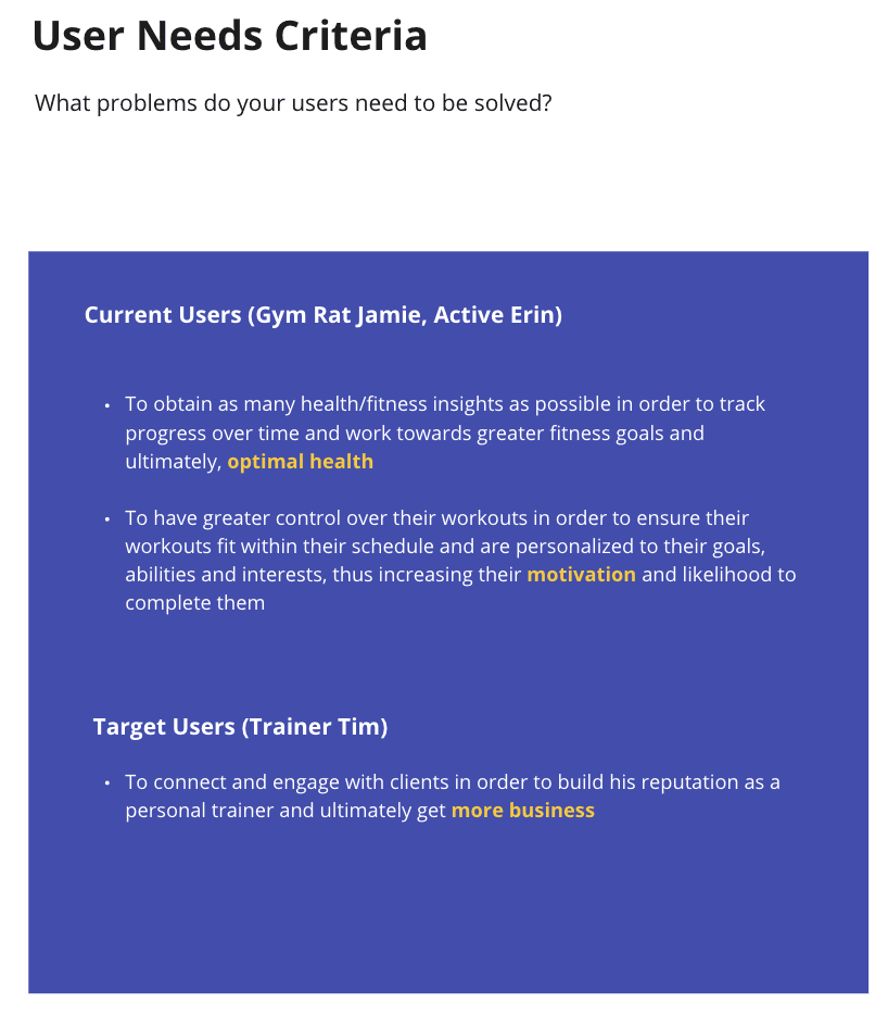
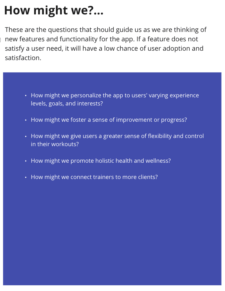
The goal of the Ideation Workshop was to determine and prioritize the best ideas to work on for this project. Looking back on each persona, I formulated User Needs Criteria and subsequent How Might We Statements to guide our ideation exercise. Meeting attendees were given 1 minute per How Might We Statement to generate as many ideas as possible to solve the statement, and then had 10 votes to place on their favourite ideas.

The top voted ideas were then moved over to a Feature Prioritization Matrix based on User Value and Effort to implement
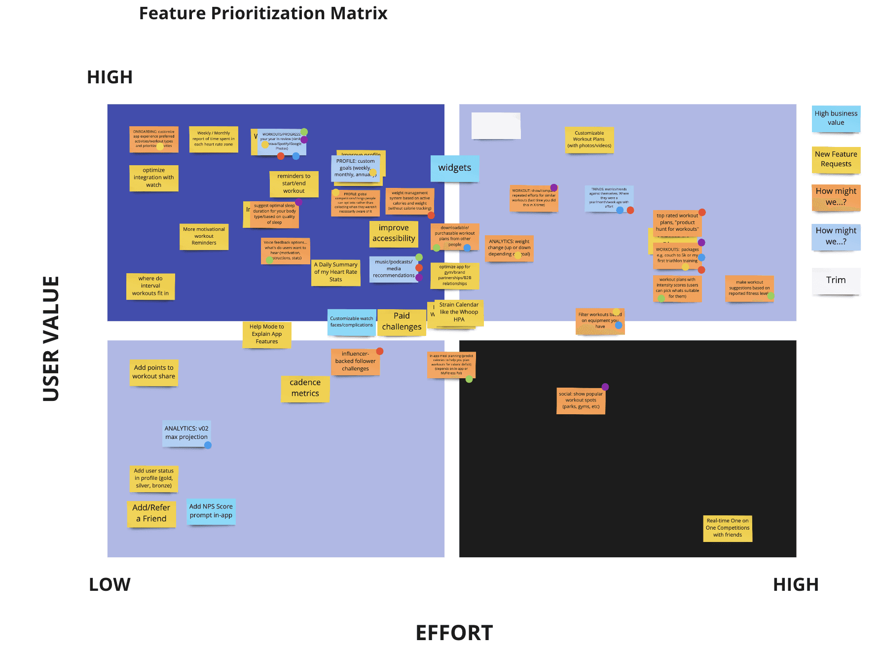
Ideas that were high user value were prioritized, with the lower effort being taken on by the FITIV team and the higher effort being the focus of our project due to more expertise and focused exploration required. These features included:
Prebuilt workout plans
Metrics trends
Post-workout stats for interval training
Downloadable/purchasable plans from app members
Build your own workout plans and programs
Custom goal setting (weekly, monthly, yearly)
Opt-in community challenges
PHASE 3
Design & Test
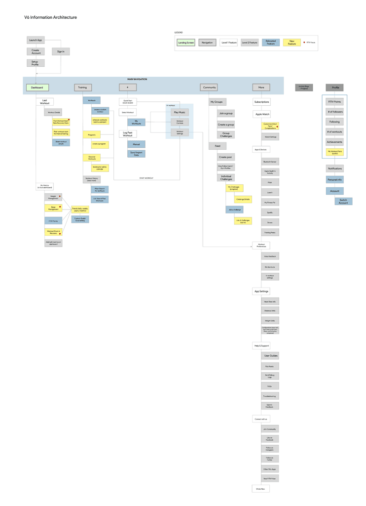
Information Architecture
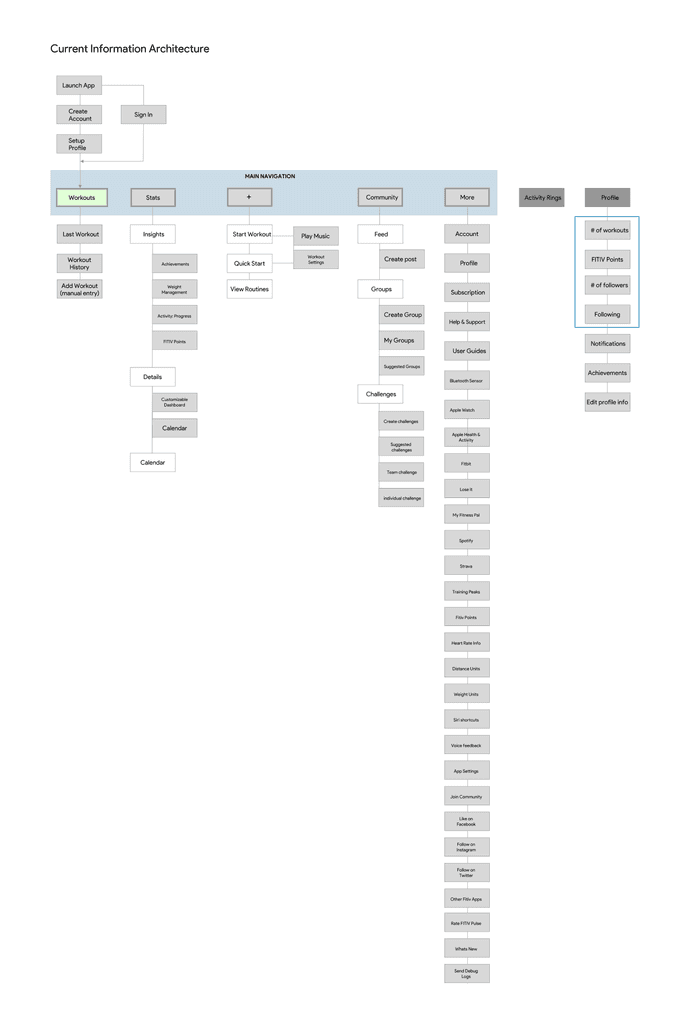
Now that we determined the new features and major usability changes to make, I drafted the new information architecture (IA) diagram to map out how all of the features fit together and where to find them in the app. Each iteration was shared with the client team for feedback until they were happy with the structure.
Wireframing
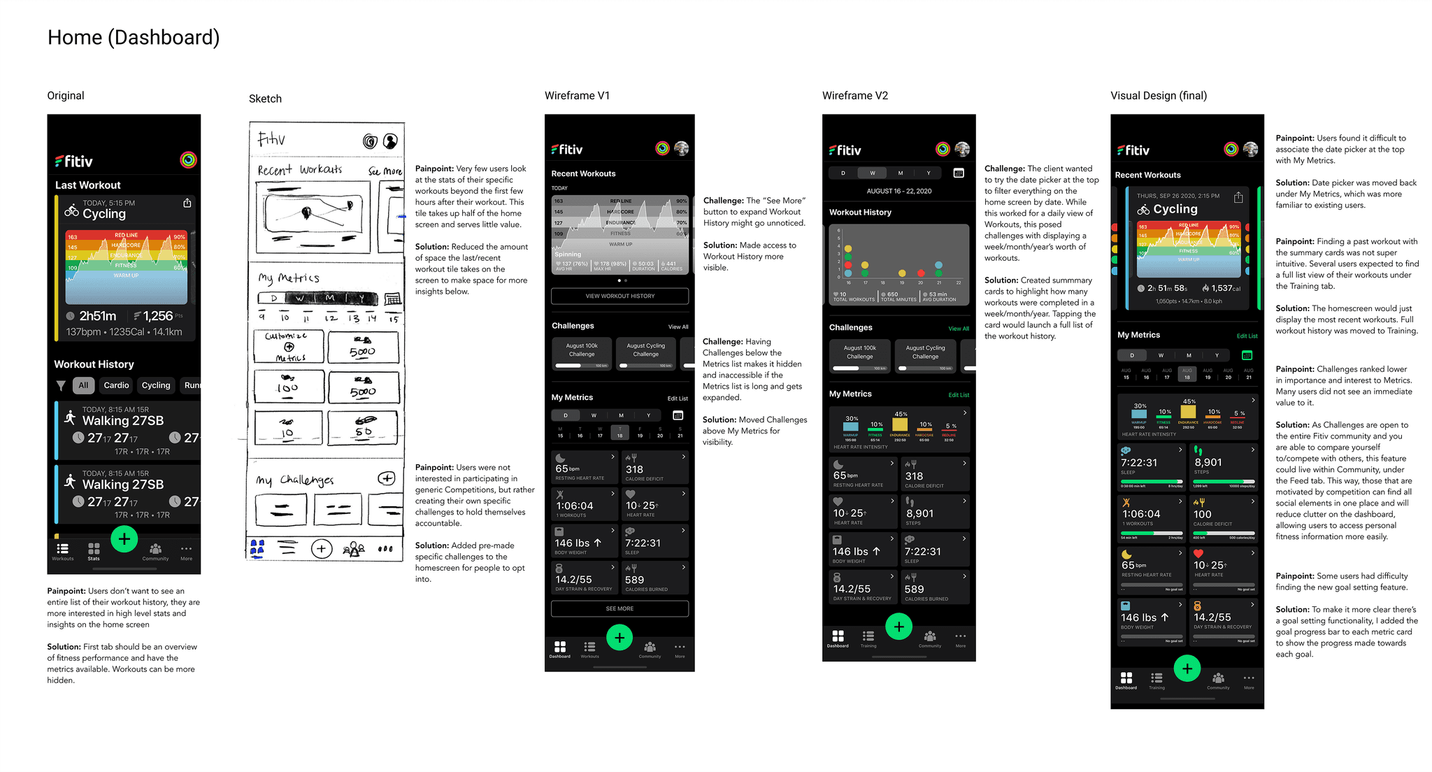
Alongside the IA diagrams, I began sketching out how each screen would look and function and received early feedback from the client team before jumping into more detailed wireframes. Given that the client already had an established component structure and library, I used these elements in grayscale to quickly iterate on later versions of wireframes. There were 2 major iterations of wireframes completed before user testing, and another after user testing (see below).
Usability Testing
Usability testing was conducted on the 2nd major iteration of wireframes. I created a User Testing Toolkit for the client to run these on their own, which consisted of a test plan and script, consent forms, participant screener, note taking guide, and grayscale prototype. 27 people completed the screener, and 6 individuals across a variety of ages, fitness levels, activity types, and app experience were selected to participate in a 1 hour-long usability test session led by the client team.
These were the research questions and assumptions we wanted to test:
Do users need a schedule of their workouts in-app?
Are users comfortable with their workouts being viewable by other members?
Are users able to find the workout history?
What are users' thoughts on goal setting?
What types of trends info do users expect to see?
What types of post-workout stats do users expect to see?
What do users think is the difference between programs, workouts, and all workouts?
Are users able to find their saved/bookmarked workouts?
Do users have a need to create workout programs?
Are users able to create subsequent programs/workouts after the first program/workout is created?
What is the user experience of creating a program/workout?
What heart rate info do users expect to see on their daily dashboard?
How and where do users expect to be able to tag their workouts?

Key Findings
Difficult to associate date picker with metrics since it is hidden when the user scrolls (prototype limitation)
Finding a past workout was not very intuitive as users expected to find a full list view of their workouts they could parse through.
Challenges ranked lower in importance and interest to Metrics. Many users did not see an immediate value to it.*
While most users were interested in the concept of personal challenges, few users were interested in seeing a generic leaderboard.
Recovery Heart Rate stats was difficult to find.
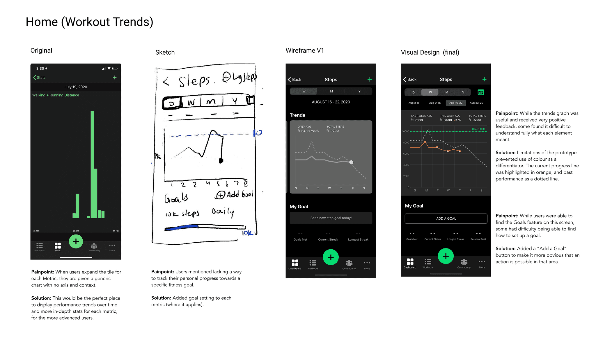
Trends graph was useful but difficult to understand fully what each element meant.
While users were able to find the Goals feature, a few users struggled with finding how to set a goal.
Users would like to see all heart rate stats in one place and unsure what MHR is.
Still some confusion around the difference between Programs & Workouts. Some users assumed Workouts relate to past activities you have completed.
Adding a workout to a program was not very intuitive. Activity type was not clear as there can be multiple activities in one program.
My Schedule was not overly exciting and takes up too much space for little value. Some users mentioned scheduling workouts within their personal calendars.
Final Solution
Lessons Learned
Managing lower budgets and timelines: This project ended up going over budget and extended past the typical timeframe we spend on a Design Blueprint project (6-8 weeks). Some reasons for this included that rather than having all client team members on the design review calls, we only had our main point of contact who would then share with his team and they would follow-up with several documents of written feedback from each team member for each iteration of the IA. This was a time consuming process that took up a lot of the budget, however I made sure that moving forward on wireframe reviews, I would either have the entire team present or had the client consolidate his team's feedback. Furthermore, the client had to take a break from the project to focus on an internal app release, adding 2 months to the wrap-up of the project. Given that we were working with a small budget, clearer expectations on the format and timeframe that feedback should be given should have been established better at the beginning to mitigate this.
Don't offload the user testing: Due to small budget, the client wanted to handle conducting the usability testing of the wireframes. Being their first time, we created a User Testing Toolkit which consisted of a participant screener, test plan and script, and prototype. Offloading the testing did not save us as much budget as we hoped, as a lot of time was spent on creating a script with guidelines and tips, training the team on how to conduct a usability test, and we were tasked with analyzing the raw data and coming up with actionable recommendations afterwards. Furthermore, some flows were left untested due to running out of time. Testing is something that should be done by or alongside a trained researcher, and therefore should not be offered as an option for inexperienced clients.
© Samra Ebadi 2024
